27 September 2026 · 14 min read
4 5 Size in Pixels and Posts: A Practical Guide
Learn what 4 5 size means for photos and videos, the best pixel dimensions for social feeds, and simple cropping tips to make every post look polished.
You've got the photo. The pose works. The caption is ready. Then the upload screen shrinks everything into a thumbnail, and suddenly the frame you liked in your camera roll doesn't feel as confident in the feed. That's the moment most creators start guessing, crop left, crop right, keep the text, lose the background, and hope the post still reads cleanly on a phone.
4 5 size is the format that usually makes that decision easier. It gives a portrait post enough height to feel intentional in a scrolling feed, without jumping all the way to full-screen vertical.
Table of Contents
- The Photo That Stops the Scroll
- What 4 5 Size Actually Means
- How 4 5 Compares to Other Ratios
- Recommended Pixel Sizes by Platform
- Cropping and Reframing Tips That Hold Up
- Repurposing Long Video Into 4 5 Clips
- Mistakes That Quietly Ruin a 4 5 Post
- A Quick Pre-Upload Checklist
The Photo That Stops the Scroll
A good image can feel strong on a laptop and fragile in a feed. A portrait from a recent shoot may look balanced in your editing app, then turn awkward once it sits beside usernames, captions, and other posts in a crowded scroll. The problem isn't the image itself, it's the moment you realize the platform is now doing part of the framing for you.
That's why creators end up making tiny decisions that matter a lot. Does the subject stay centered if the crop gets tighter? Does the background still tell the story if the top and bottom get trimmed? Will the caption still read when the image is viewed at a glance? Those are the publishing questions that matter, not the abstract math.
A 4:5 frame solves a lot of that tension because it gives the post more presence in the feed without demanding the full-screen commitment of a vertical video. On a phone, that extra height helps the image feel like it belongs there instead of sitting like a small square that users can skip past. It also gives you more room to protect faces, text, and product details from awkward cuts.
Practical rule: if the first preview looks too small, too cramped, or too easy to swipe past, a 4:5 crop is usually the first format worth testing.
That's why this guide treats 4 5 size as a publishing choice first, and a ratio second.
What 4 5 Size Actually Means
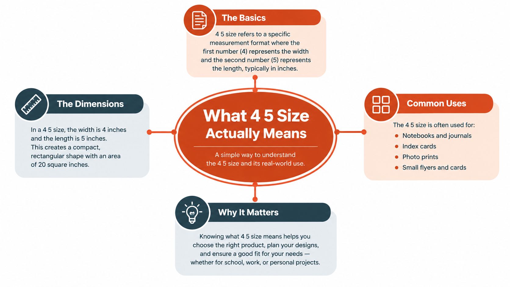
At a visual level, 4:5 is a portrait rectangle that's a little taller than a square, but not so tall that it takes over the entire screen. Another way to think about it is simple, the height is a bit more generous than the width, so the shape feels upright and orderly without becoming a full phone-screen slab. In social feeds, that balance is what makes it so useful.
Its roots go back to 4×5-inch large-format film, which is part of why it still feels familiar in photography circles today. The same shape survived the move from film to digital because it keeps portraits, products, and people in a clean, upright composition. Modern feed publishing then standardized that look around 1080 × 1350 pixels, which is the common digital version of the ratio and the tallest size Instagram allows in the main feed without cropping, as noted in Shopify's aspect-ratio guide on best aspect ratios for photos.
The number matters less than the proportion
The pixel count can change as long as the shape stays the same. A file can be larger than 1080 × 1350 and still be a valid 4:5 frame if the proportions match. That's why designers often work with higher-resolution exports when they want extra sharpness, then keep the same visual ratio for the final post.
What matters most is that the frame stays portrait and stays consistent. A feed platform reads the relationship between width and height, then decides whether to display the post cleanly or crop it into something else. If the ratio drifts, the image loses the benefit of being built for that space in the first place.
The practical takeaway is easy. 4 5 size is not a magic pixel count, it's a stable shape that keeps a post readable, mobile-friendly, and less vulnerable to platform trimming.
How 4 5 Compares to Other Ratios
A square post and a 4:5 post can show the same subject, but they don't behave the same way in a feed. A 1:1 square sits compactly among neighboring posts, which can be useful when you want the layout to feel neutral. A 4:5 portrait gives the image more vertical presence, so the viewer sees more of it before scrolling onward. A 9:16 frame pushes even further and takes over the whole screen, while 16:9 horizontal can feel like a thin strip in a mobile-first scroll.
That difference changes the publishing job. If the image needs to stop attention without feeling like a full-screen interruption, 4:5 is usually the middle lane. If the content is meant to immerse the viewer, 9:16 is stronger. If the frame is more cinematic or widescreen by nature, 16:9 may be the right choice, but it often asks for a more deliberate setup in a feed.
| Aspect Ratio | Relative Feed Height | Viewport Behavior | Best For |
|---|---|---|---|
| 1:1 | Compact | Easy to scan, less dominant | Grid-friendly posts, visual consistency |
| 4:5 | Taller than square | Claims more screen space without full takeover | Portrait photos, product posts, feed-native clips |
| 9:16 | Full-screen vertical | Dominates the phone display | Reels, Stories, TikTok-style video |
| 16:9 | Shorter in mobile feed | Feels wide and easy to scroll past | Landscape video, cinematic stills |
The interesting part is how that changes the viewer's experience. In a vertical feed, 4:5 feels like the post is asking for attention, while 1:1 feels more restrained. 9:16 can be too aggressive for a still image that doesn't need full immersion. 16:9 can work, but it often sacrifices presence unless the content is clearly built for that shape.
Creative director note: choose the frame based on the moment you want to create. For a still image that needs more room, 4:5 is often the cleanest compromise.
Recommended Pixel Sizes by Platform
The easiest way to think about 4:5 export sizes is this, keep the ratio stable and use the platform's preferred width when possible. On Instagram feed posts, 1080 × 1350 pixels is the standard portrait export, and it matches the ratio platforms are built to handle cleanly. Facebook feed posts use the same portrait logic, with guidance that also points to a 4:5 vertical display. LinkedIn and Threads can display portrait formats too, though the exact crop behavior can vary by surface.
For Pinterest, a common portrait pin size is 1000 × 1250 pixels, which keeps the same general feed-friendly upright feel even though the platform's core recommendation for pins is taller. TikTok and Instagram Reels are more naturally tied to 9:16, but 4:5 can still be useful when you want a clip that lives comfortably in a feed-style environment instead of filling the entire screen. YouTube thumbnails are usually built around 16:9, so 4:5 is less central there, though it can still show up as a selected frame or supporting visual in a broader content package.
The biggest technical habit is simple, export wide enough to stay crisp on modern phone screens. Hitting 1080 pixels wide gives you a strong baseline for sharpness, and keeping the ratio exact prevents awkward platform-driven crops. If you export from a 4:5 template once, that file can often travel across different feed surfaces with minimal rework.
Here's a practical cue from the editor's chair. If the file looks soft at 100 percent in your design app, it'll usually feel softer once the platform compresses it. That's why clean source resolution matters more than fancy processing later.
| Platform | Recommended Pixels | Min Width | Format |
|---|---|---|---|
| Instagram feed | 1080 × 1350 | 1080 | Portrait post |
| Facebook feed | 1080 × 1350 | 1080 | Portrait post |
| Pinterest pin-style portrait | 1000 × 1250 | 1000 | Portrait image |
| LinkedIn feed | Portrait crop varies by surface | Use a high-width export | Feed image |
| TikTok or Reels preview use | Best handled as a native vertical export | Use a high-width export | Short-form clip frame |
Cropping and Reframing Tips That Hold Up
A clean 4:5 crop starts with protecting the subject first and the background second. If you're converting a horizontal image, place the face, product, or speaking subject where the frame feels anchored, then let the empty space do the supporting work. That usually means keeping the main subject away from the very top edge and away from the bottom area where captions, profile elements, and interface chrome can interfere.
Rule-of-thirds placement helps here because it gives the eye a place to rest. A person's face often looks better a little above center than jammed at the exact midpoint, especially when the platform may add its own overlays. A bit of breathing room above the head also keeps the crop from feeling accidental, like the frame was cut off by mistake instead of chosen on purpose.
If you're reframing a talking-head clip, keep the speaker locked to the active part of the frame. That prevents the sideways drift that makes vertical crops feel nervous. Editors often do this in batch with presets, then preview the result in-app before posting so they can catch a hand, a shoulder, or a subtitle line that ends up too close to the edge. For a deeper workflow on adding overlays and finishing touches, this guide to adding a watermark to video fits naturally into the same editing pass.
A good crop should feel boring in the best way. Nothing competes with the subject. Nothing touches the frame unless it's meant to. The viewer should notice the message, not the crop.
Repurposing Long Video Into 4 5 Clips
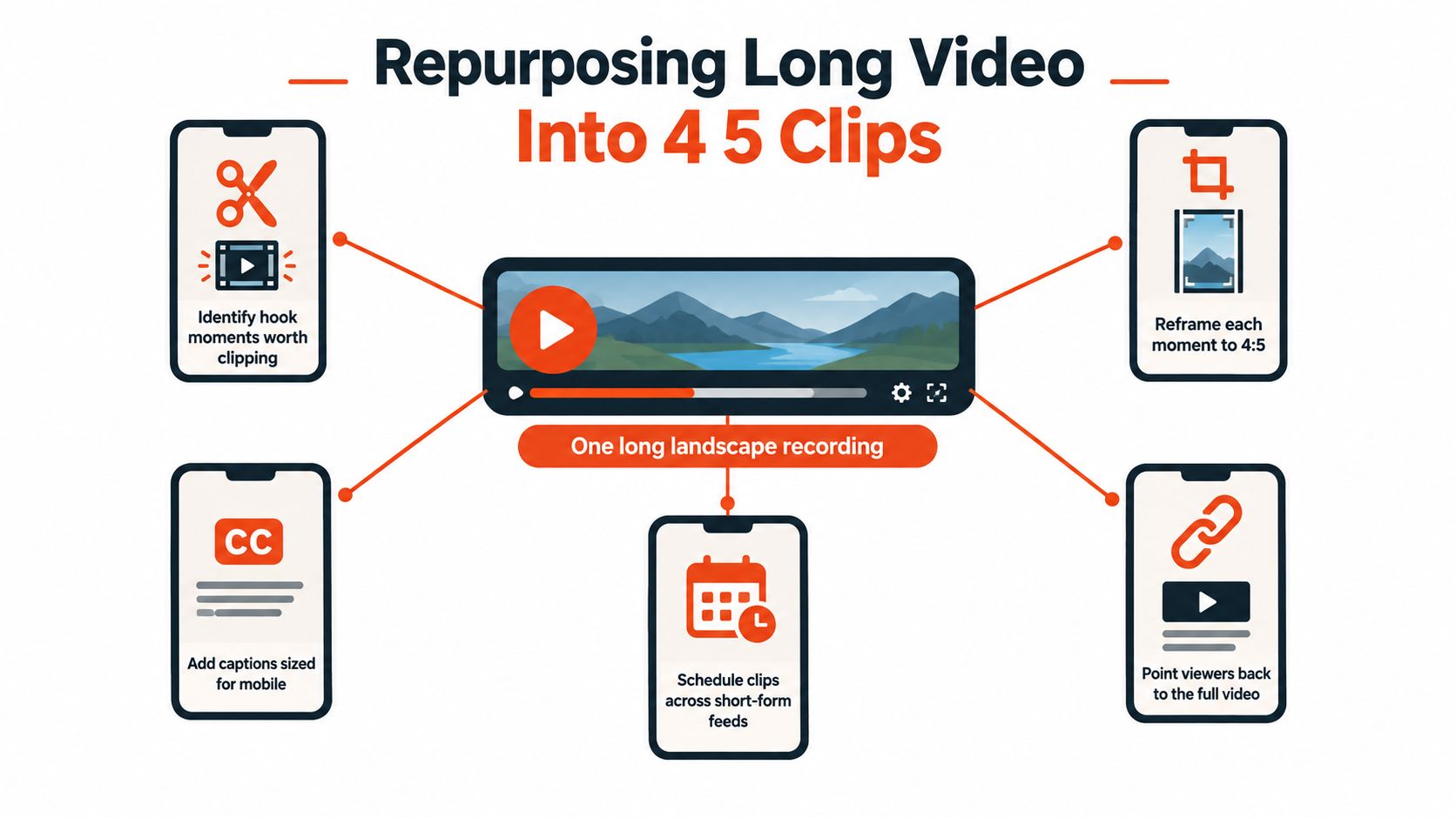
4:5 gets especially useful when one long recording has to become several feed-ready pieces. A single webinar, interview, or demo can yield short clips if you choose moments that start cleanly, resolve cleanly, and don't need much outside context. That's where the format earns its keep, because it gives the clip enough vertical space for the speaker and the captions without forcing the entire post into a full-screen story format.
The export step matters more than many people realize. If the master is cut to 1080 × 1350, the clip usually feels at home in Instagram and Facebook feeds, and it still stays manageable for other short-form workflows. Burned-in subtitles work well here, but they need to sit inside the safe zone so they don't fight with buttons or lower-screen overlays. A subtitle line that looks fine in the editor can become awkward once the platform adds its own UI.
When teams process a source once and then reframe from that master, the weekly workflow gets easier. One source can later be turned into 1:1, 4:5, or 9:16 depending on the channel, instead of making every export from scratch. Keptbits follows that logic by turning long recordings into short clips with speaker-aware framing and multi-aspect exports, which is useful when you need the same moment ready for several feeds.
Workflow rule: cut the moment first, then choose the frame. The frame should serve the clip, not rescue it.
This overview of AI tools for YouTubers is useful if your 4:5 workflow is part of a broader repurposing stack.
Mistakes That Quietly Ruin a 4 5 Post
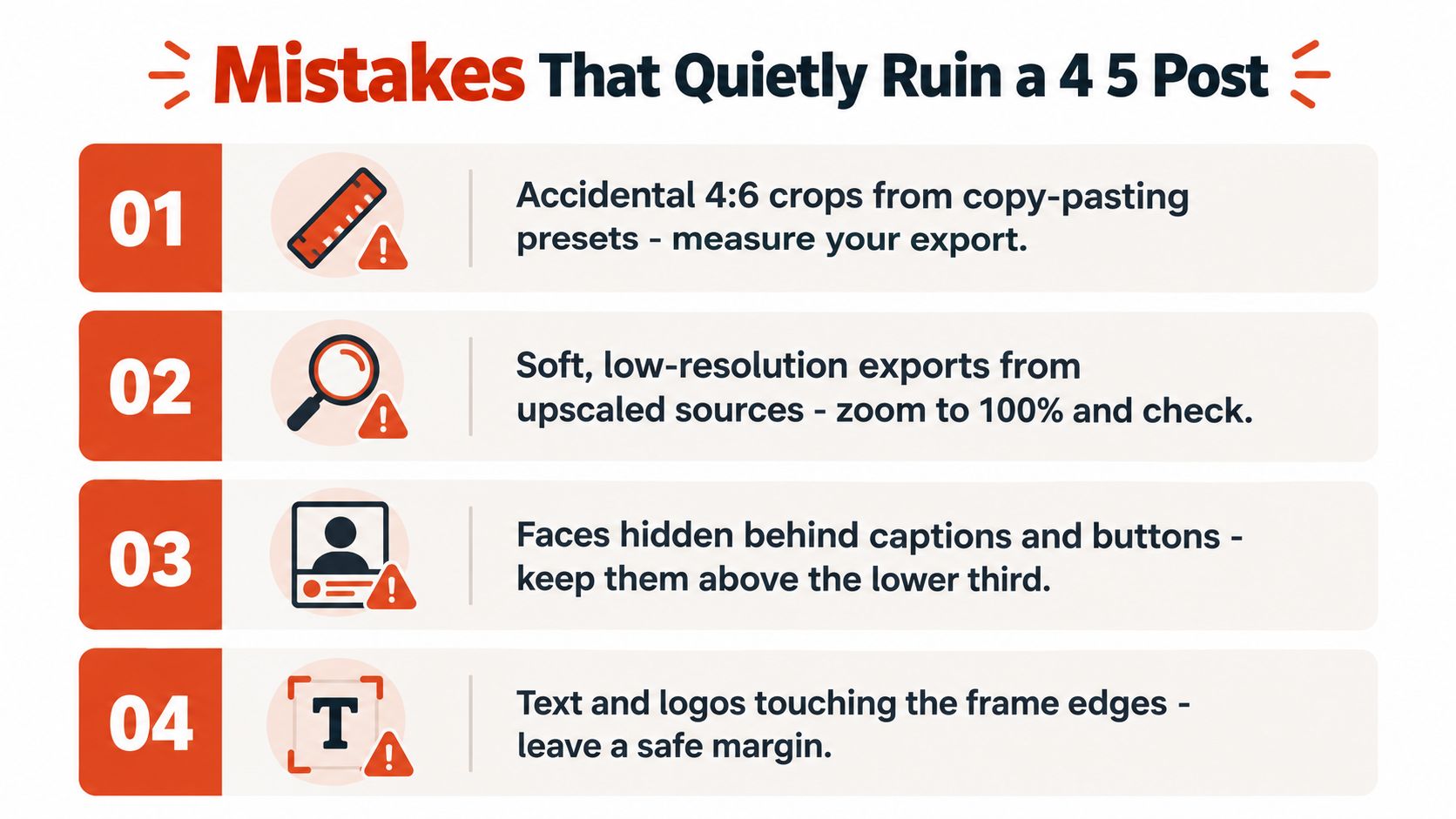
A strong post can still underperform if the crop is sloppy. The most common mistake is copying a preset without checking whether it preserved the ratio, which can leave you with an accidental crop that no longer feels like true 4:5. Another easy slip is stretching a square file to fit a portrait template, which warps faces, products, and text in a way viewers notice immediately.
Low-resolution exports cause a different kind of damage. If you push a soft source through compression, the platform usually makes the texture look even flatter. Tight crops can also backfire when hair, hands, hats, product corners, or props land right on the edge of the frame and make the composition feel cramped instead of deliberate.
There's also the problem of overlays. A username bar, caption block, or button can cover a face, a logo, or a key line of text if the subject sits too low or too high in the frame. Watermarks and burned-in subtitles can create the same issue when they're placed near the bottom edge and collide with the platform's own interface. For automated captions, this captioning guide pairs well with a 4:5 export check because it reminds you to leave room for mobile UI.
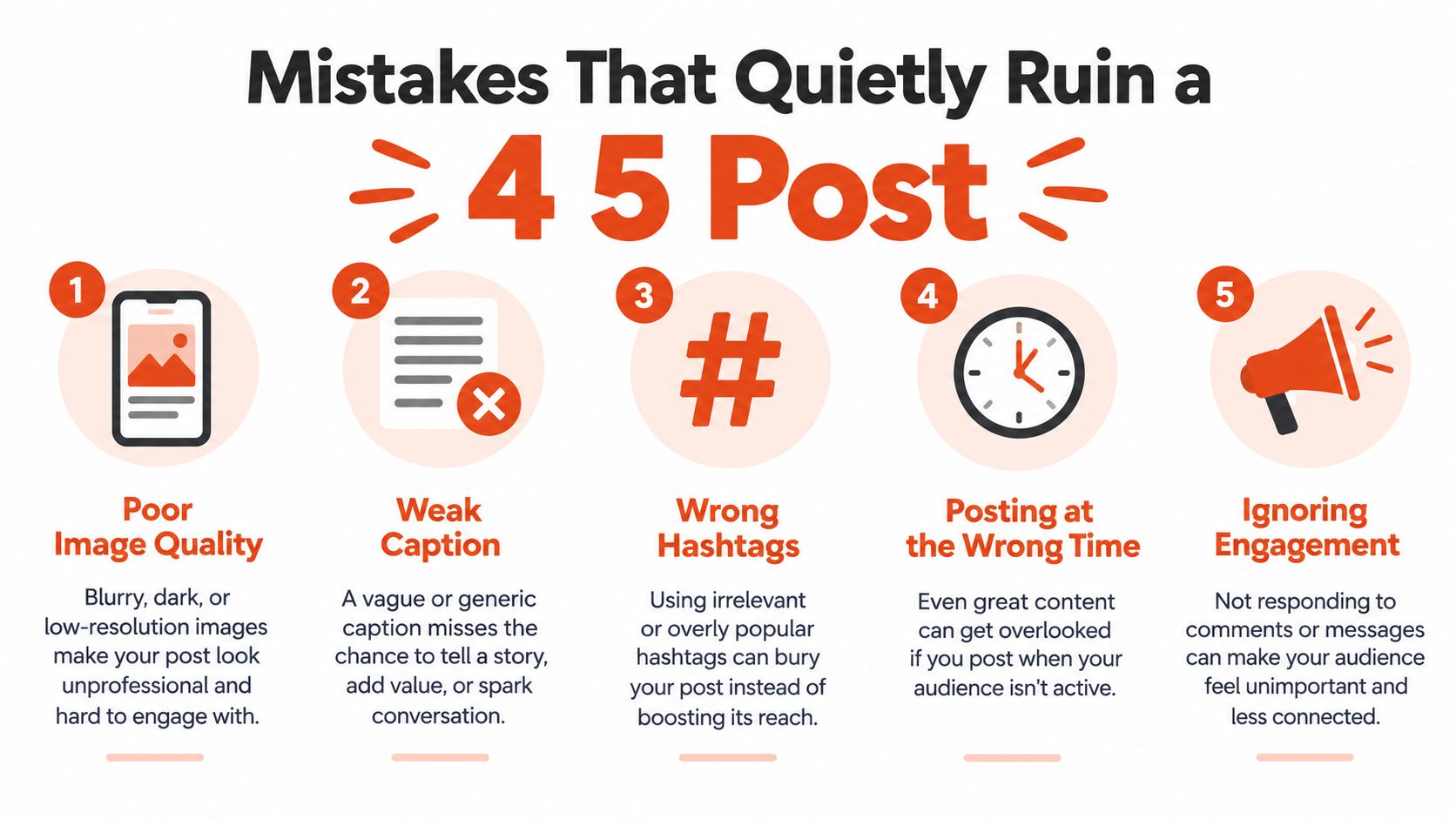
The fix is usually boring, which is good. Measure the export, check the crop, preview at phone size, and keep the important parts away from the edges. That discipline does more for performance than fancy gear ever will.
A Quick Pre-Upload Checklist
Before you publish, run the file through the same quick checks every time. Confirm the export is 1080 × 1350 or the correct 4:5 equivalent, open it at 100 percent to make sure the details still look sharp, and check that the subject sits inside a safe area where platform UI won't crowd the frame. Then preview it on an actual phone, because a desktop preview can hide problems that show up instantly in the feed.
Give the cover frame one last visual scan beside the rest of your grid. If the brightness feels wildly out of place next to neighboring posts, the image may look louder than intended once it lands in sequence. The last question is the simplest one, does it still read as a clear 4 5 size post when it's small enough to fit in a scrolling thumb?
- Check the export size: make sure the file is exactly 4:5, not a stretched square or a slightly off portrait.
- Zoom to 100 percent: look for softness, warped faces, or text that blurs when viewed at real size.
- Protect the safe zone: keep faces, captions, and logos away from the top and bottom edges.
- Preview on your phone: judge the post at the size people will see in practice.
- Compare it to the grid: see whether the image still feels balanced beside your other posts.
Keptbits turns long recordings into short clips with speaker-aware framing, captions, and multi-aspect exports, which makes it a practical fit when your 4:5 posts come from webinars, interviews, or demo footage. If you want a cleaner way to prep feed-ready clips without re-editing every format by hand, visit Keptbits and see how it fits into your publishing workflow.
Keptbits cuts on sentence boundaries.
Paste a link or upload an episode, say how many clips you want, and get them back captioned and vertical. The free plan needs no card.
Start freeRead next
10 Video Editing Tools Online for Faster Content
Compare 10 video editing tools online for captions, automation, free tiers, aspect ratios, collaboration, and practical browser-based workflows.
That's a Good Deal: How to Evaluate True Value
Wondering if that's a good deal? Learn how to evaluate true value, decode pricing models, and spot the difference between a bargain and a trap.
10 Vertical Video Editor Tools Compared
Compare 10 vertical video editor tools for reframing, burned-in captions, and Shorts, Reels, and TikTok export workflows.